When building a design system, we like to see components rendered in isolation. What better tool to do that than Storybook? We can see our components, wrap them in decorators, and show our stakeholders beautiful user story demos.
Once we know how our components should look, we want to test them. For that part, I love to use Cypress component testing. How great would it be if we could just re-use the stories from Storybook to test our component? After all, the first thing we do in most component tests is to set up the Component Under Test (CUT), exactly like writing a story.
The challenge
Do any of the following resonate with you?
- In order to demo your components in Storybook, you need a context, a theme provider and/or wrappers
- Your components rely on global app CSS to render correctly
- You spent a long time setting up Storybook to get your components to work properly
- You do not want to have to rewrite all this configuration all over again just to test your components
Fortunately, we can reuse the configuration you already made in Storybook for Cypress component testing.
With Cypress component testing, we start tests by using the mount(<Comp />) function, which "mounts" the imported component in the Cypress sandbox. The rest of the test's code looks like a Cypress end-to-end test. You can use any part of the Cypress API to interact with your component.
Since we can mount any React components, and since Storybook stories are really React components, we could, in theory, mount Storybook stories directly imported from story files.
Well, almost.
This doesn't quite work because it ignores decorators and any special config created for Storybook. Mounting stories directly will make them look different from what they do in Storybook.
Use @storybook/testing-react
The team at Storybook already faced a similar issue: They wanted to test stories with Jest. So they created @storybook/testing-react, a library that compiles decorators and configuration into a composed story.
This code properly mounts a story for testing by Cypress. And it will compile story decorators with the story!
import * as React from "react";
import { composeStories } from "@storybook/testing-react";
import { mount } from "@cypress/react";
import * as stories from "./MyInput.stories";

// compile the "Primary" story with the library
const { Primary } = composeStories(stories);

it("Should empty the field when clicking the cross", () => {
  // and mount the story using @cypress/react library
  mount(<Primary />);

  // then run our tests
  cy.get("svg").click();
  cy.get("input").then((i) => expect(i.val()).to.be.empty);
});
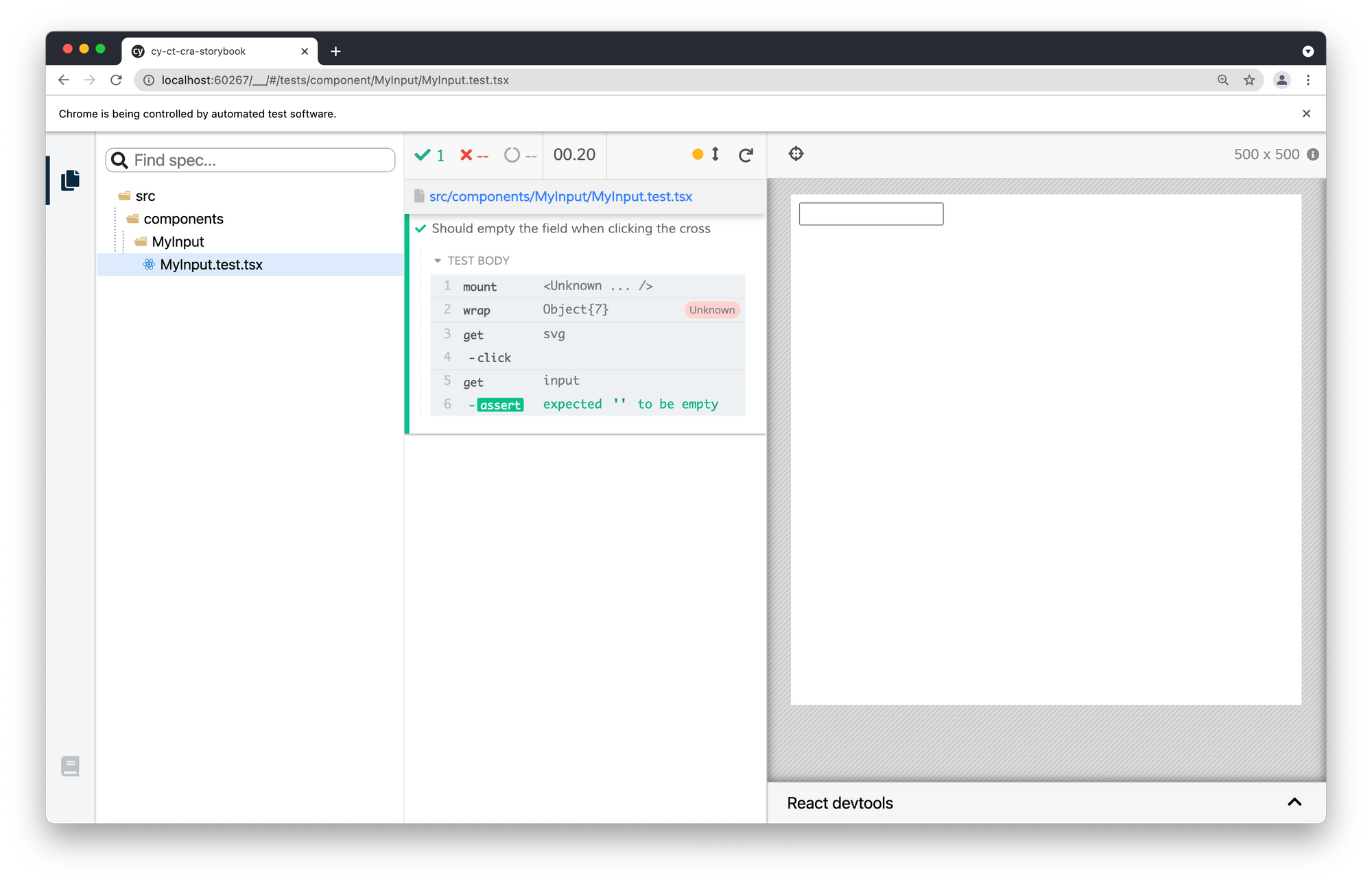
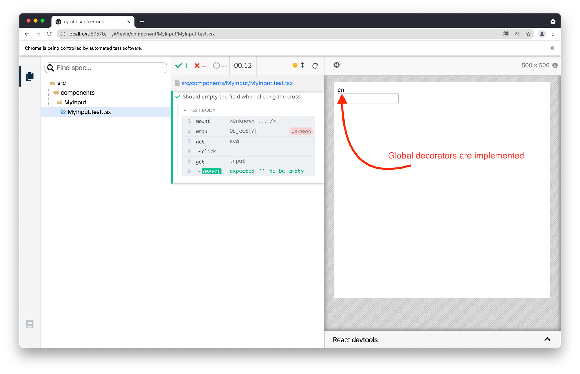
MyInput.test.tsxYou thought it would be that easy? Well, almost. As you can see, the test works, but the global decorators are missing:

Use Storybook Globals in Cypress
In Storybook we can set decorators at the story level, at the file level and the global storybook level. If we only use the composeStories function, all decorators except the global ones will be compiled.
The global decorators are usually set in the .storybook/preview.js file.
import React from "react";

export const decorators = [
  (StoryFn, { globals: { locale = "en" } }) => (
    <>
      <div>{locale}</div>
      <StoryFn />
    </>
  ),
];
.storybook/preview.jsTo take this preview file into account in our stories, we will have to import it in its equivalent Cypress file, cypress/support/index.js
Once again, the library provides the tool we need: setGlobalConfig()
import { setGlobalConfig } from "@storybook/testing-react";
import * as sbPreview from "../../.storybook/preview";

setGlobalConfig(sbPreview);
cypress/support/index.jsNow, when I use the composeStories() function in my tests, it will take into account the decorators defined in .storybook/preview.js .

Another benefit of importing preview.js in cypress/support/index.js: Any global CSS imports you define for Storybook will automagically show up in Cypress component testing too. No need to have the global CSS configuration in multiple places anymore. 🎉
A work in progress
Importing stories from JSX and TSX files works out of the box. But to import stories written in an MDX files, we need to configure Storybook's MDX loader manually. This process makes for another post entirely. The team at Cypress is working on a better solution.
Additionally, some Storybook features like knobs and controls are not currently supported, but Cypress + Storybook integration is evolving rapidly and more features are added every release.
Keep an eye out for the updates. Happy testing to you all!
All the code for this post is in this repo: https://github.com/elevatebart/cy-ct-cra-storybook
